Presentation

The original talk was given by Yi-Hao Peng at ACM CHI 2021 Virtual Conference. The contents below include: 1) each slide frame with its corresponding alt-text descriptions, and 2) transcripts for each slide.

Slide 1

This is the title slide of the paper. The title text - “Say It All: Feedback for Improving Non-Visual Presentation Accessibility” is put at the middle left of the slides. Below it are the authors’ names, including Yi-Hao Peng, JiWoong Jang, Jeffery P.Bigham and Amy Pavel. Two logos put below the names. One of them is the logo of human-computer interaction institute, and the other is the logo of CMU ACCESS group. The whole deck of slides are mostly styled with black background and white texts.
Hi Everyone! I am Yi-Hao. Today I’ll share our project “Say It all: Feedback for Improving Non-Visual Presentation Accessibility”. This work was collaborated with Joon and advised by Jeff and Amy.

Slide 2

This slide shows a short clip of a presenter who did not describe his slides. The slide he presented included the title: Study of Existing CAPTCHAs. There is a chart displaying below it. The chart displayed the percentage of people successfully entering the CAPTCHAS within different trials. The x-axis represents the time of trials, including 1st try, 2nd try, 3rd try and never, the y-axis represents the percentage of users from 0-100% with 25% as interval. The measurement of three types of captcha are included in the chart including blind audio, sighted audio and sighted visual. In summary, most of the successful attempts for blind and sighted audio captcha are concentrated in 1st try and never, while for the sighted visual captcha most of the participants have successfully attempts on 1st try. On the right side of the chart are some details on study design. The first item initiated with the red arrow was the number of participants, which in total is 162 participants with 89 blind web users and 73 sighted web users recruited for the study. The second item initiated with the red arrow was the study procedure. There are a total of 10 examples and 10 sites in the randomized trials study design. Overall, the speaker barely described any of these visuals on his slide.
Presenters often do not describe the content on their slides, here’s an example (video played). So the presenter did not describe his slide, which included a graph and study information like the number of participants, which in this case was 162.

Slide 3

A slide with text “undescribe slide content = inaccessible presentation”.  The text “inaccessible” is highlighted in red.
When presenters do not describe the content on their slides, people who are blind and visually impaired will miss out on information in the presentation, making it inaccessible.

Slide 4

A slide with text “How often do speakers fail to describe their slides?”
But, how often do speakers fail to fully describe their slides in practice?

Slide 5

A slide describes the details of our field survey, which includes text “90 videos”, “269 slides”, “615 slide elemnts”, “half text elements” and “half media elements”. All numeric related word are highlighted with bold typeface. Below the texts there is one graphic demonstrating the spectrum of different levels of descriptions on slide contents from none, little, half, most to complete, which are colored respectively in blue, green, gray, orange and red.
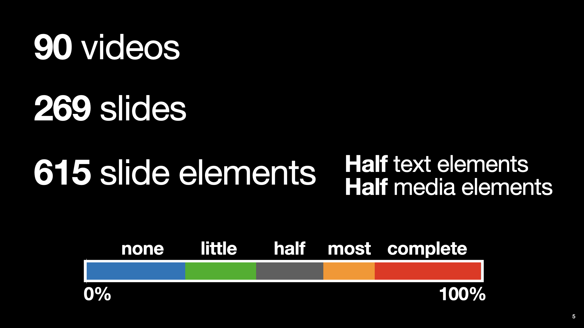
To find out, we analyzed 90 presentation videos in-the-wild. The video clips contained 269 slides, and 615 total slide elements — half of which were text and the other half media. Two people coded the speaker’s verbal coverage of each slide element as none, little, half, most and complete.

Slide 6

A slide highlights the portion of undescribed contents in usual presentations. Text “72%” placed at the center of the slides with huge font size and bold typeface. At the bottom right side of that text is text “Slide elements without key information in the description” with normal font size.
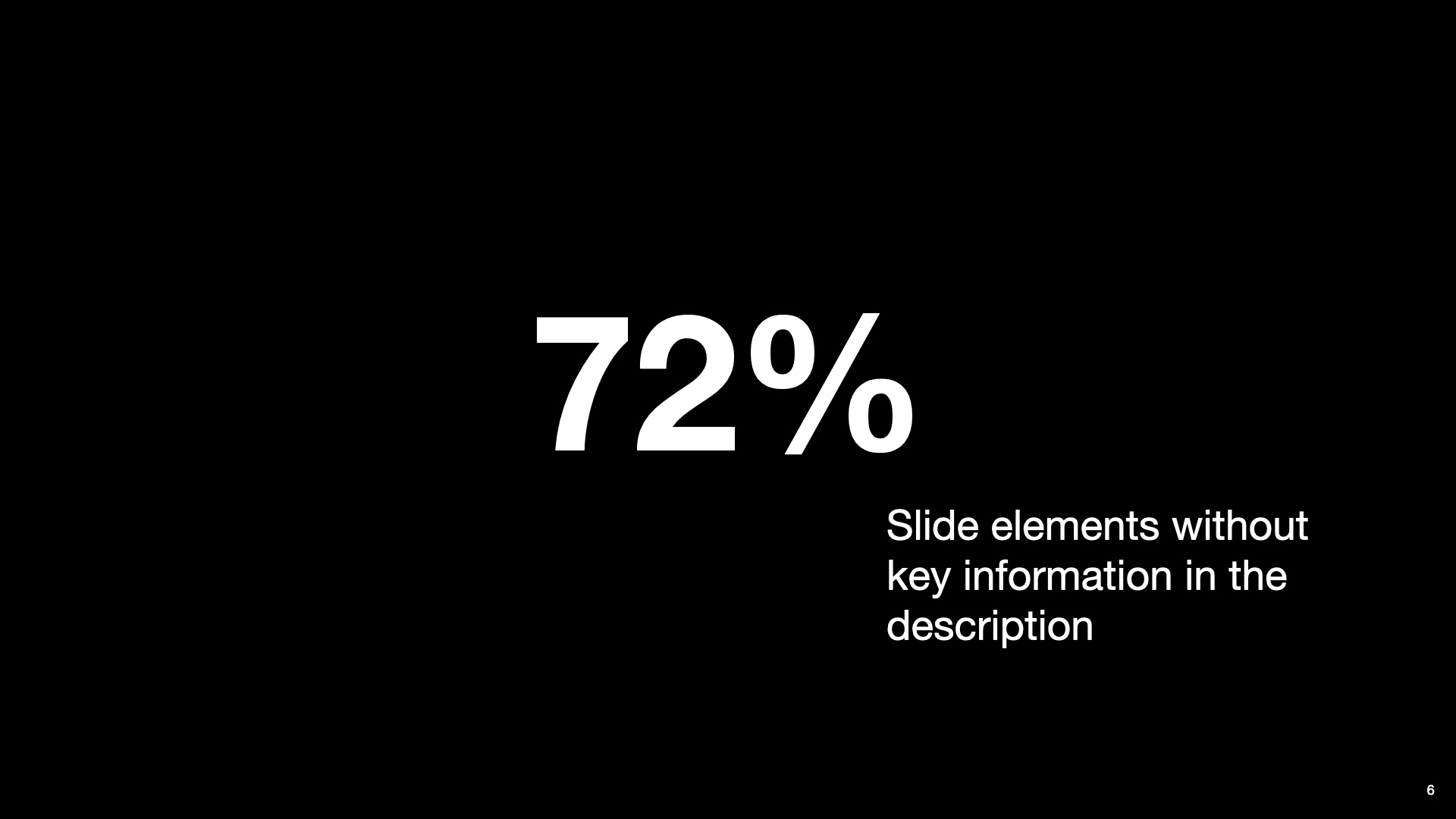
Overall, presenters did not fully describe their slides— leaving out key information for 72% of slide elements.

Slide 7

A slide shows the current presentation accessibility guidelines. Title text “Presentation accessibility guidelines” put at the top center of the slide. Below it is a bulleted list with two text items. The first item is text “Describe all pertinent visual information [W3C]”. The second item is text “Use minimal visuals [SIGACCESS]”.
When presenters are explicitly trying to create an accessible presentation they can use guidelines, like those from W3C or SIGACCESS, that suggest that speakers should describe all pertinent visual information on their slides, and use minimal visuals. However, it can still be challenging for presenters to remember to describe their slides.

Slide 8

A slide with text “Help presenters make their presentations accessible” at the middle left of the slide. Text “accessible” is highlighted in green.
So, the goal of our work is to help presenters make their presentations accessible.

Slide 9

A slide shows the overview of our system. Title text “Presentation A11y” put at the top center of the slide. Below it are the screenshots of two interfaces. On the left is the screenshot of our real-time interface with text “Real-Time Feedback” on its top. On the right is the screenshot of our post-presentation interface with text “Post-Presentation Feedback” on its top.
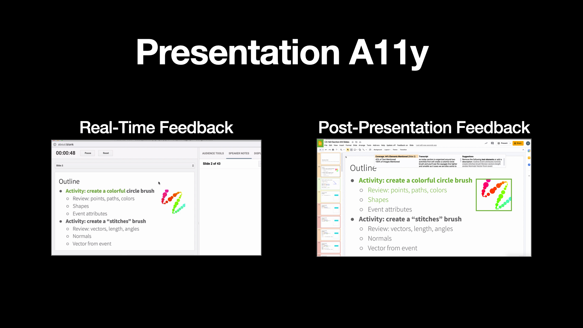
And towards this goal — We present Presentation A11y, a tool that gives automatic feedback to help presenters describe their slides. Presentation A11y provides Real-Time Feedback, and Post-Presentation Feedback.

Slide 10

This is a transition slide. It is almost the same slide as the last slide frame showing the overview of our system with two interfaces. The Real-Time Feedback interface is highlighted with bright color while Post-Presentation Feedback Interface is styled with dark color.
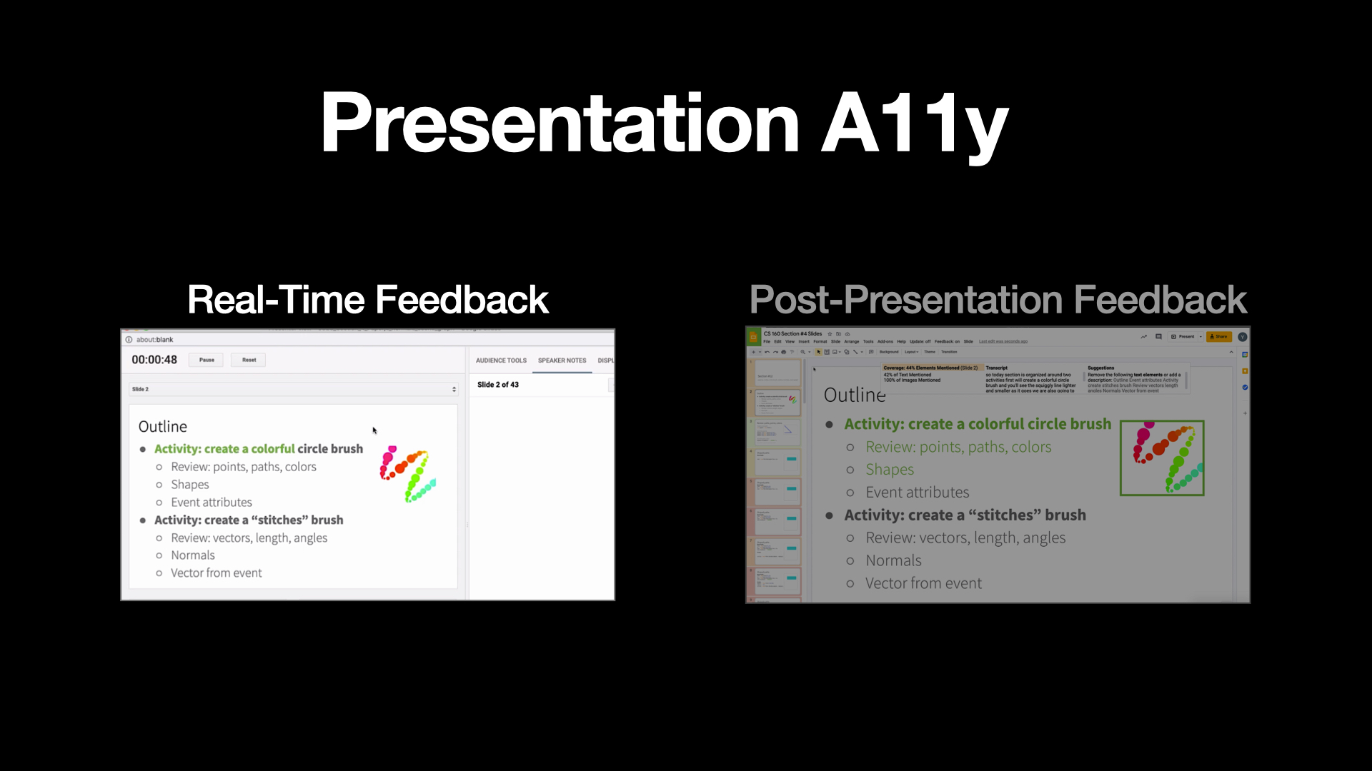
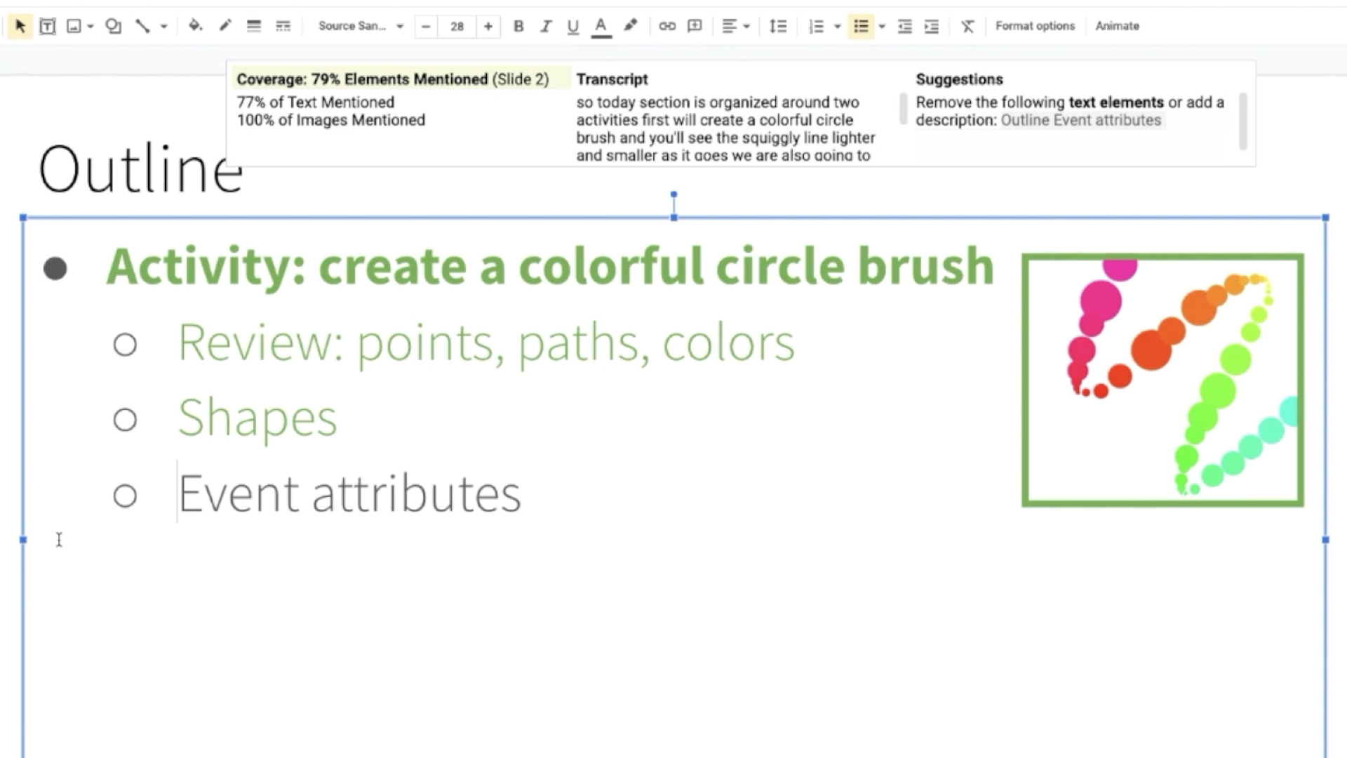
The real-time feedback interface

Slide 11

This is the slide that shows the demo clip of our real-time feedback interface.  On the top of the slide are text “Real-Time Feedback” and text “Augments Presenter view”. Below it is the presenter view of Google Slides, including the timer, the buttons for switching to the previous or next slides, the current slide content, the previewed content of previous and next slides, and the speaker notes section. The animation first showed a green arrow pointing to the word “Activity” colored in green within current slide content, which demonstrated the mentioned word was highlighted, and a red arrow pointing to another unmentioned word “Activity” which was not highlighted. The played clip then demonstrated when speakers said “create a colorful circle brush” and depicting the image of a colorful squiggly line, the corresponding words were highlighted in green and the image was highlighted with a green border.  The text “display: on” in the speaker note section then be marked with a red border to show the feedback can be turned on or off.
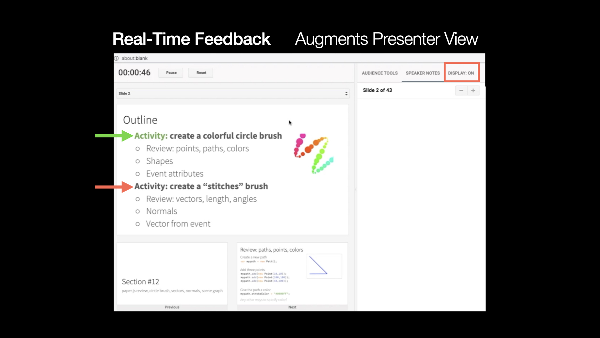
augments the existing Google Slides presenter view, to give presenters feedback on what they have (click) and have not described (click). In this video, the interface highlights the slide text “create a colorful circle brush”, and an image depicting the circle brush, as the speaker describes them (video played). Presenters can also turn on or off the feedback display.

Slide 12

This is a transition slide. It is almost the same slide as the prior slide frame showing the overview of our system with two interfaces. The Post-Presentation Feedback interface is highlighted with bright color while the Real-Time Feedback Interface is styled with dark color.
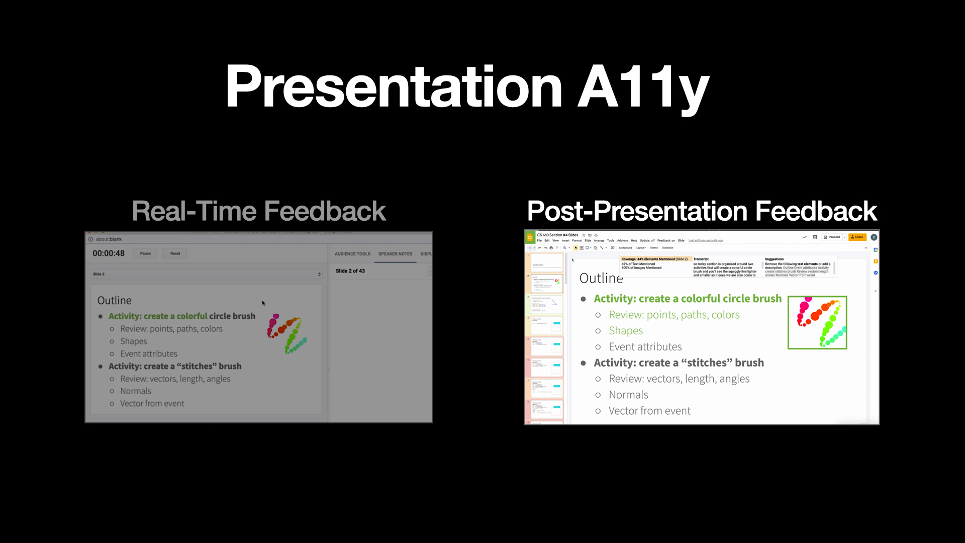
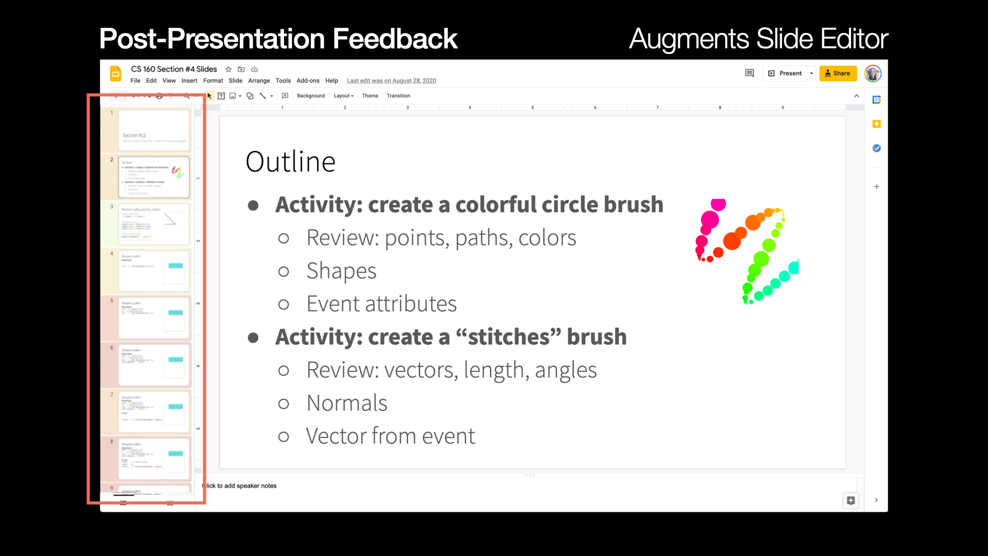
On the other hand, our post-presentation feedback interface

Slide 13

This is the slide that shows the Post-Presentation Interface. On the top of the slide are text “Post-Presentation Feedback” and text “Augments Slide Editor”. Below them is the google slide editor that contains the preview section of each slide on the left and main slide section on the right that shows the same content as demonstrated in the previous presenter view. It includes the title “Outline”. Below it are two bullet text items. The first item is “Activity: create a colorful circle brush” with three subitems “Review: points, paths, colors”, “Shapes”, and “Even attributes”. The second item is “Activity: create a stitches brush” with three subitems “Review: vectors, length, angles”, “Normals” and “Vector from event”. An image of a colorful squiggly line placed on the right side of the slide.
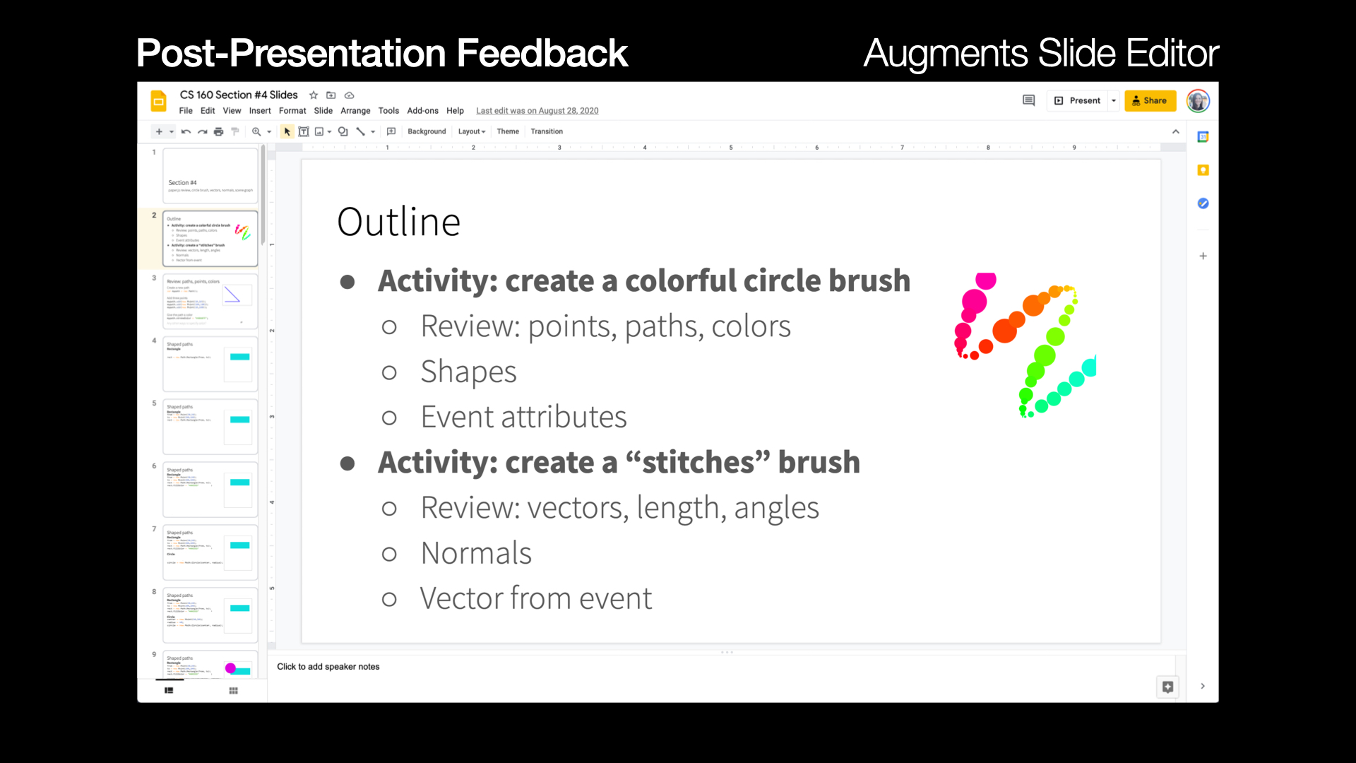
augments the Google Slide editor to let users review their results.

Slide 14

This is the slide that shows the same post-presentation interface as shown in the previous slide. The preview section of each slide on the left  is highlighted with a red border. It shows that each preview slide is highlighted with different colors from red to green, where red represents that speaker did not describe most of the slide contents while green represents speaker describing most of the slide contents.
Users can quickly identify what slides they did and did not describe well by glancing at the slide overview — it shows poorly described slides in red.

Slide 15

This is the slide that shows the same post-presentation interface as shown in the previous slide. The first bullet text item “Activity: create a colorful circle brush” and its two subitems “Review: points, paths, colors” and “Shapes” are colored in green. The image of a colorful squiggly line is also highlighted with a green border.
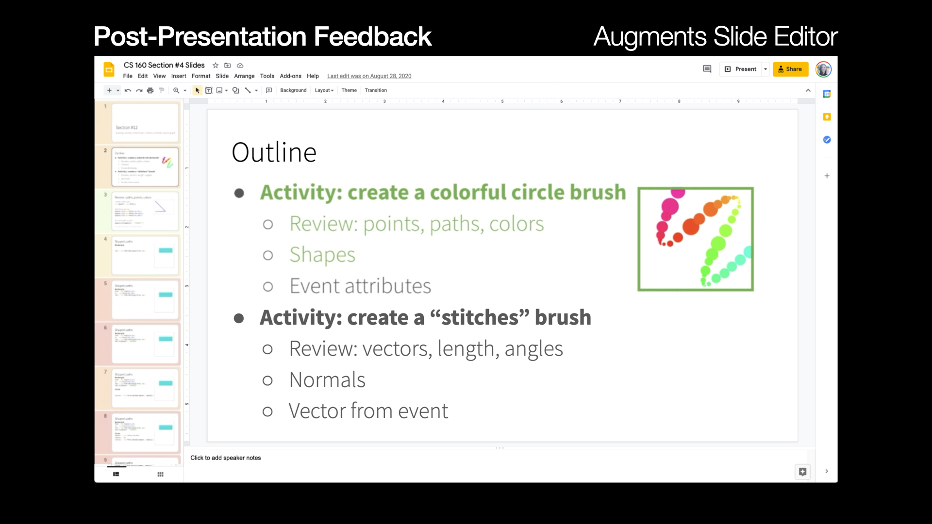
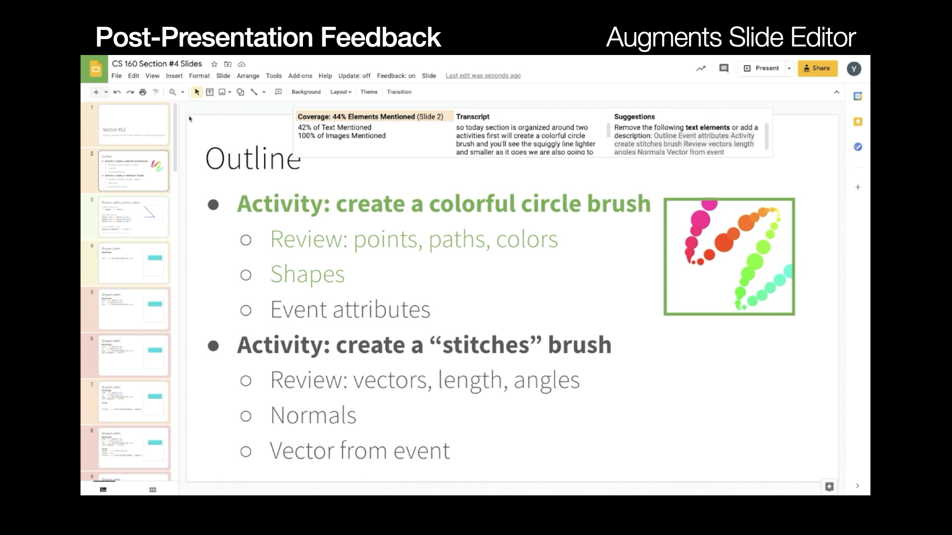
When editing each individual slide, Presentation A11y highlights the elements that were described during the presentation in green.

Slide 16

This is the slide that shows the same post-presentation interface as shown in the previous slide with additional results panel overlaid on the top area of the existing interface. The result panel consists of three parts. On the left is the coverage percentage of speaker’s narrations on slide contents, which in this case is 44%. In the middle of the panel is the raw transcript of speech. On the right is the accessibility suggestion section, which includes the suggestions such as removing certain undescribed elements or adding the descriptions for undescribed elements in the transcripts.
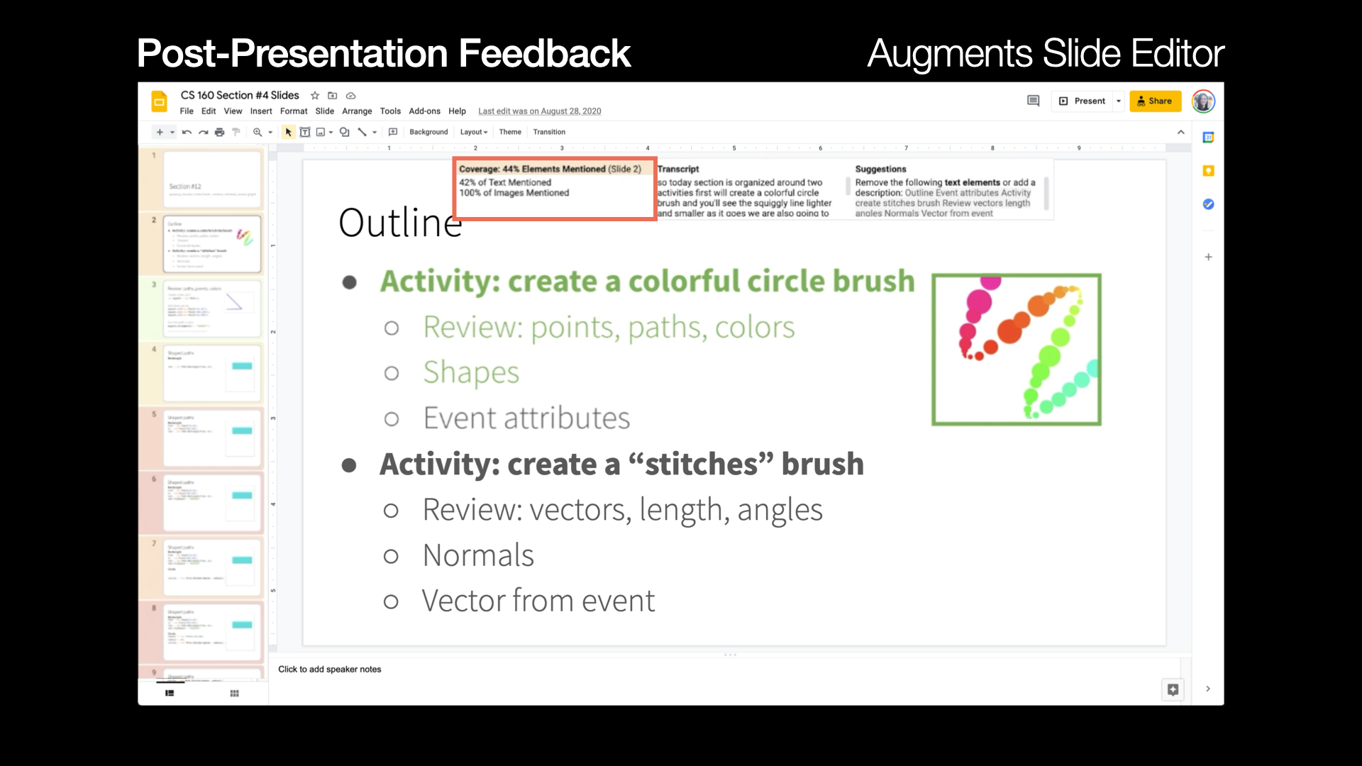
A results panel shows the slide’s coverage percentage, the transcript recorded during the talk, and specific suggestions for how to make the slide more accessible.

Slide 17

This is the slide that shows the demo clip of our post-presentation feedback interface. The demo example is still the same interface and contents as shown in previous slides.  In the video, the speakers removed undescribed bullet text item “Activity: create a stiches brush” along with its three subitems “Review: vector, length, angles”, “Normals” and “Vector from event”. The coverage percentage was changed from 44% to 79% after removing the undescribed contents.
(video played) The interface updates the coverage percentage as the presenter edits the slide,

Slide 18

This is the slide that also shows the demo clip of our post-presentation feedback interface with the zoom-in shot. Following the previous slide, after removing the undescribed elements, the speaker started trying to add the descriptions to transcripts for the undescribed contents. Specifically, in the video, the speaker added the undescribed text “Event attributes” to the transcripts, and the coverage percentage was changed from 79% to 93%.
(video played) or edits the transcript to add description.

Slide 19

This slide shows the details of the user study. Title “User Study” is placed on the top center of the slide. Three bullet text items displayed below the title. The first text item is “16 people presented their own slides”. The second item is “Presentation: Present slides, half with and half without our real-time feedback”. The last item is “Review: identify changes with and without our post-presentation feedback”.
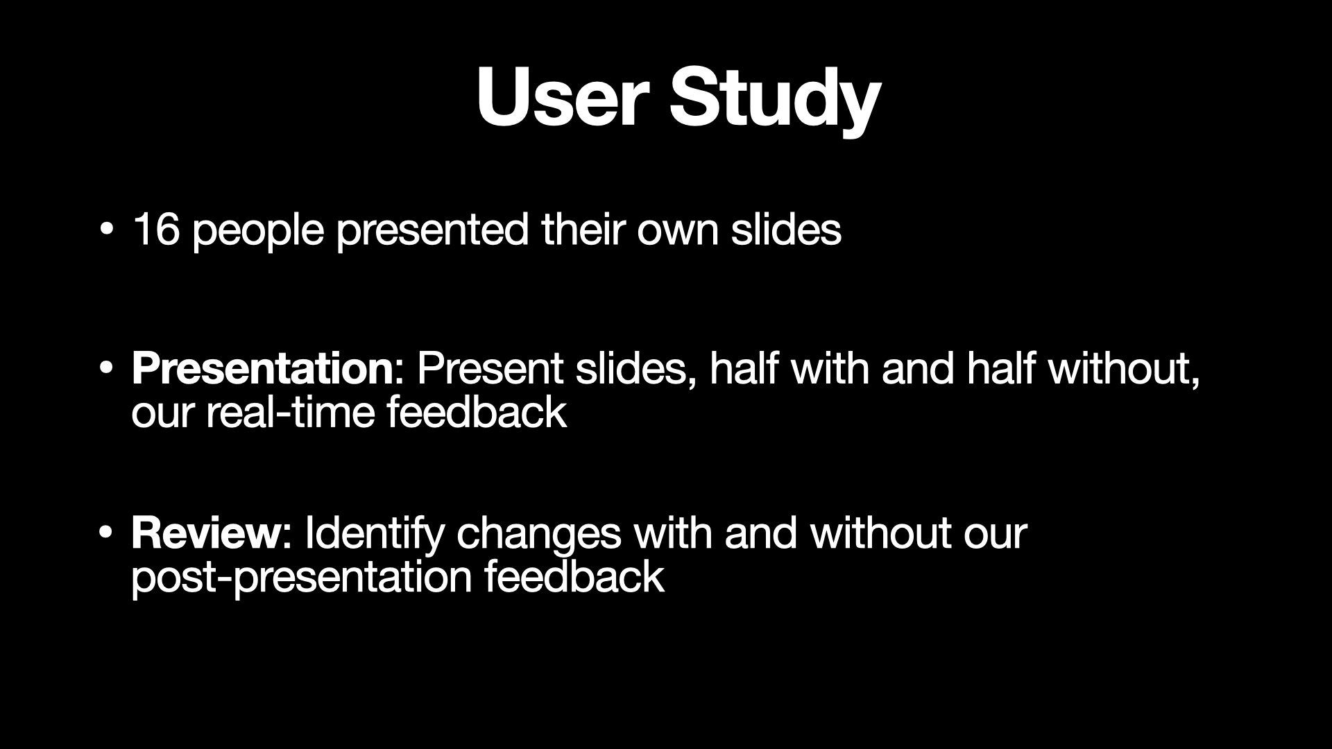
We invited 16 people to present and review their own slides with Presentation A11y. Users presented half of their slides with real-time feedback and half without. After the presentation, they reviewed their slides with and without our post-presentation feedback.

Slide 20

This slide shows the study results as a table. The first column contains three different metrics we evaluated. The first row is two comparison subjects, our system and default interface. The second row is the text coverage %, where our system is 57% and the default interface is 46%. The third row is the image coverage score, where our system is 3.5 and the default interface is 3.1. The last row is the number of accessibility edits identified, where our system is 2.3 and the default interface is 0.7. Our system significantly outperformed all the metrics compared to the default interface.
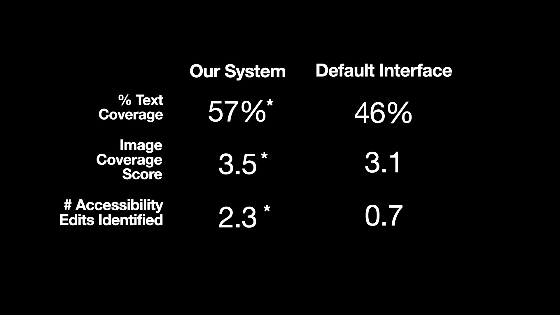
Presentation A11y’s real-time feedback helped people describe significantly more text and images than the default interface. For text, people covered 57% of text with and 46% of text without our system. People achieved an image coverage score of 3.5/5 with and 3.1/5 without our system. In addition, the post-presentation feedback helped people identify significantly more accessibility changes to make in the future than they did without our feedback. People identified 2.3 changes with our system and 0.7 without.

Slide 21

The title “Future Work” is placed at the top left of the slide. Three items placed side-by-side below the title. The first item contains text “Improve Feedback for Media” and an image depicting a couple of web pages with an alternative tag placed on top of the text. The second item contains text “Accessible feedback” with a waveform icon and play icon placed on top of the text. The last item contains text “Deployment” with a Chrome logo placed on top of the text.
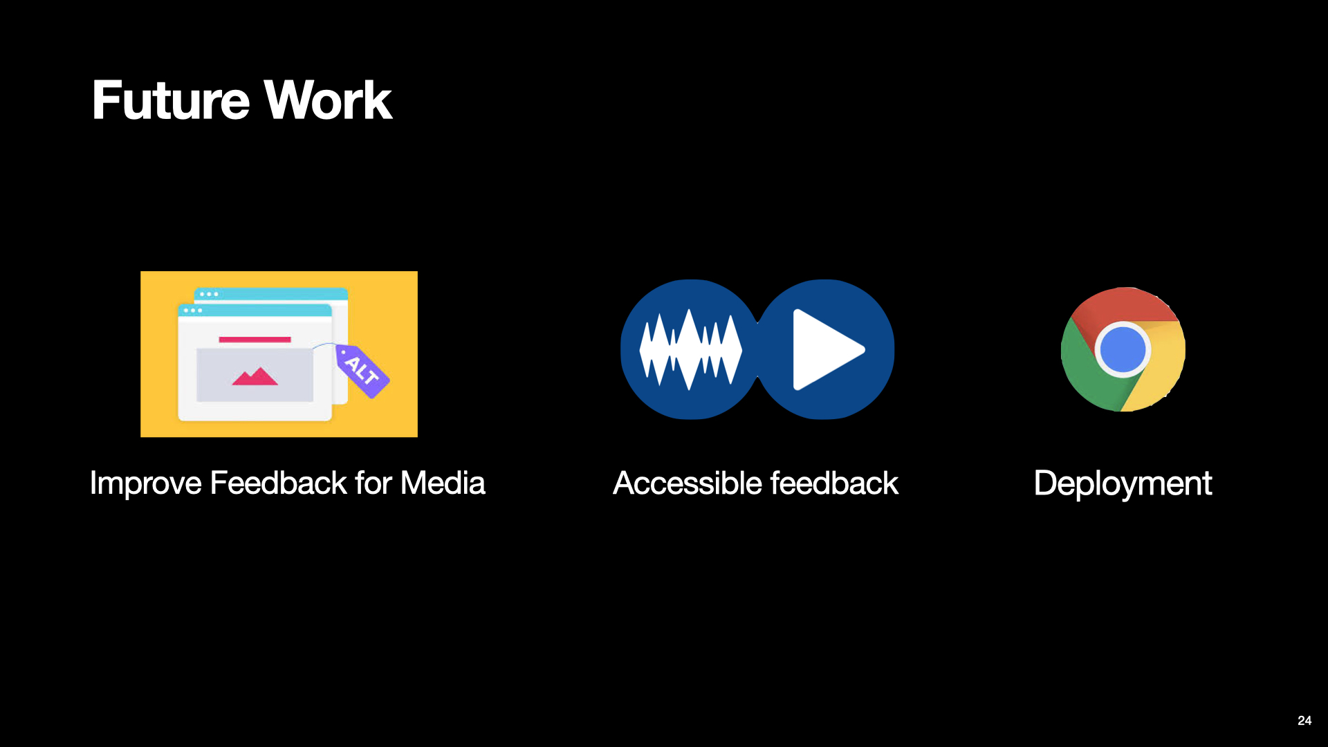
In the future, we plan to provide people more granular feedback on how to describe their images and diagrams. Also, our current interface is not accessible for blind and low vision presenters because it relies on visuals for feedback. We plan to make a screen-reader accessible tool in the future. Finally, we plan to deploy the tool as a Google Chrome Extension.

Slide 22

This is the last slide. Three text blocks placed from the top to the bottom with left alignment. The first text block is “sayitall.github.io”. The second text block is “Say It All: Feedback for Improving Non-Visual Presentation Accessibility”, and the final text block contains names of all four authors including “Yi-Hao Peng”, “JiWoong Jang”, “Jeffrey P. Bigham” and “Amy Pavel”.
With that, I would like to end my talk. For more information, you can find it at sayitall.github.io, thanks!
The design of this page was inspired by Dr. Amy X. Zhang's public released presentations.